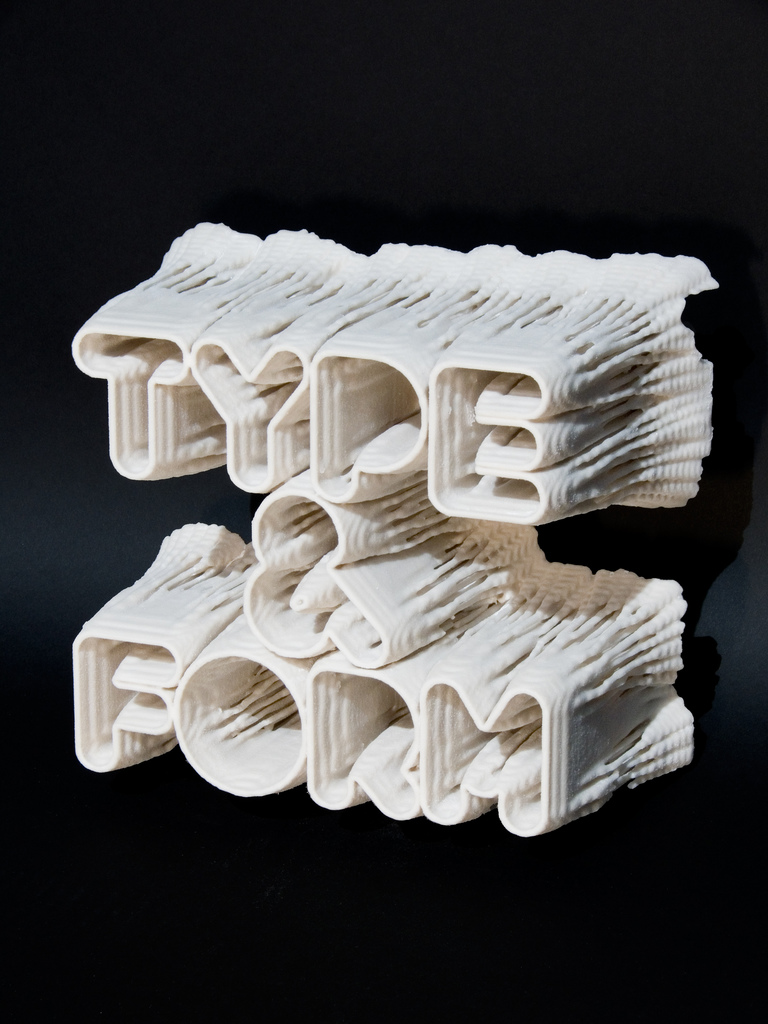
Post-Spectacular studio, directed by Karsten Schmidt, in 2008 developed a dimensional typography Type & Form experiment that explores boundaries between animation, code, concrete poetry and sculpture. By synthesizing formal elements with technical skill, Schmidt establishes a benchmark for digital typography.
The Type & Form font was grown generatively using a reaction-diffusion model. Pixels migrate into and populate rough letterform masks (islands that have sprouted in the diffusion fluid). 2D slices of pixels adhering to the substrate boundaries of this algorithmic process combine to form a 3D volume. The methodology borrows techniques from MRI data scanning. The final result is output from a 3D printer. This process is like an incunabula[3] of the digital age.
But is that all it is? Is it only typography? If so, then why consider it in the context of digital poetry? As noted elsewhere, Gomringer prophetically worried that concrete poetry might someday degrade into “…an empty entertainment for the typographer”[1]. Type & Form might seem at first glance to be vulnerable to such a critique. Lacking in direct references to either human experience or organic nature, it can be interpreted as a superficial design exercise. Superfluous technology applied without concern for deeper resonance. Yet, an alternative interpretation is equally valid.
Type & Form is a computational and poetic use of materials that explores language as mediated entity. It is a static fossil for now, but future descendants will be kinetic. Borrowing algorithms of fluid diffusion that mimic the flow of blood or estuaries to develop its form (mathematics as meaning generation), superimposing complex layers (ambiguity and/or the classic striated onion of literary studies), extruding data into brittle stone (inverse Frankenstein algorithms where process petrifies), Type & Form contains within its developmental process all the crucial vectors of a digital (and literary) post-post-modernity. Linear flat paper poems become architectural nodes; concrete poetry gets an extrusion upgrade.

Obviously, this project entailed a firm grasp of code and computational process. In an interview at OFF 2009, Karsten outlined his view on the divide between artists and technicians: “…you have all those creatives who don’t do any technical stuff, which I think is the totally wrong approach, because how can you do creative stuff in the field without the technical expertise or the craft skills?”[2]. His view has resonance for digital poet-artists (who faced by the inexorable learning curve mountain range) outsource their tech tasks. A continuity argument: medieval scribes typically knew how to use inscription tools, concrete poets coveted typewriters, digital poets develop intimate proximal relations with digital tools.
Letterform newborn. Semantic sensuality.
[1] Solt, Mary Ellen. 1969. Concrete Poetry; a World View. Bloomington: Indiana University Press.
[2] Quotation from vimeo video posted on blog at http://postspectacular.com/
[3] Incunabula is a fancy word, it sounds like the bile of a tree frog, or the foam that erupts from the mouth of hardrives, but instead refers to the first books created with the printing press in Europe (before 1501).