Neville Brody,
—The Face (1980)
—Fuse (1990: a conference and studio initiated 6 years after Macintosh was released in 1984)

David Carson,
—-Raygun (1992) this handmade (by Carson) music-magazine born in the hardcore era that had Henry Rollins on its first cover stimulated adrenalin rushes in those who found it, and has now spawned a couple decades of emulators (notably beer companies, wrestling tournaments and army advertisers who like that hardcore cool gritty stuff yet lack the capacity to instigate their own typographic revolution)

online intro to the Carson’s text(ure): a short film by Hillman Curtis on David Carson
—the end of print is the title of a book published by Carson: illegible blurred tattered punk ano-digital
—end of a mindset, end of a way of looking at print as pages of paper.
LettError
–1989, two Dutch designer-typographers who began with meta design
–designed Beowolf which is a typeset designed to look different every time
…designers who hacked in to make fonts designed procedurally following a formula as postscript files

–designed Superpolator which allows fonts to be interpolated (squeezed and squished thru code) first published as a Python library.Major advantage of this was to brainstorm. Because kerning is optical and subjective its requires a kerning table within the code.
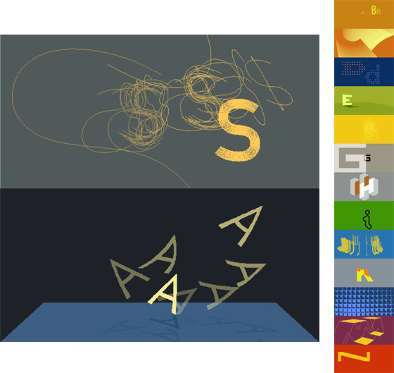
John Maeda Flying Letters
1995 – reactive book series:”reactive graphics,
visual experiences that respond to user input in realtime in a way that defies
physics (not virtual reality) and are devoid of content (not interactive media
in the ordinary sense)” —MIT Visible Language Workshop that became Aesthetics & Computation Group and eventually in 2003 Physical Language Workshop
Sample projects from VLW:
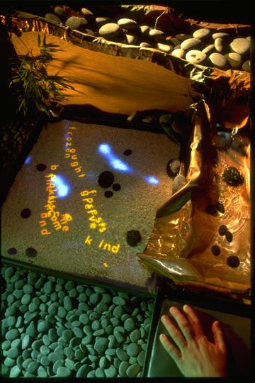
stream of consciousness

Peter Cho (graduate of MIT VLW) Typotypo is his site.
— Typemenot (1997)
— Letterscapes (2002)

Benjamin Fry
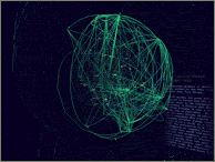
— Valence (1999)

